Free Design Service
 RAPID Turnaround Times
 PRICE BEAT Guarantee
 0800 177 666






 Collections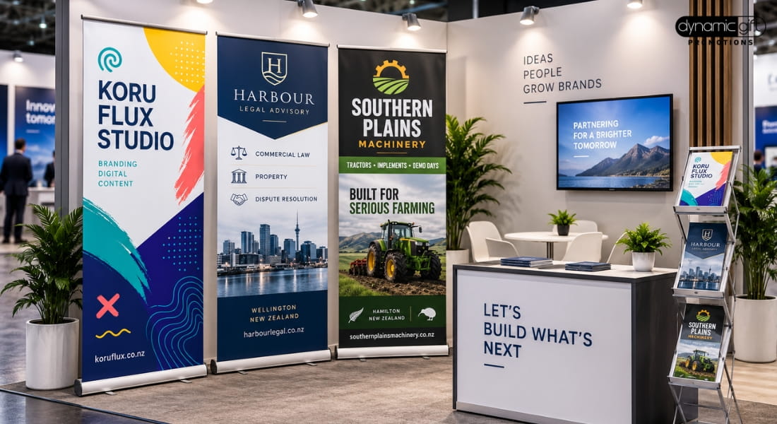
Two exhibitors can have the same footprint, similar signage and a comparable budget, and one still pulls more traffic than the other. The difference usually comes down to three things: how the stand is laid out, what visitors are offered, and how the staff on it present.
This guide covers the strategic side of exhibiting, the decisions made before the show, not the packing list on the day. If you need the practical version, see the trade show checklist.
Booth Layout: Design for Approach, Not Just Display
Most stands fail on layout before they fail on anything else. Visitors decide whether to approach a stand within a few seconds, and layout is what makes that decision easy or hard.
- Open the front. A counter or table across the entire front edge of a booth creates a barrier, even unintentionally. Angling furniture, or leaving a clear gap to walk through, invites visitors in rather than making them stop and ask permission.
- Put signage above eye level. A pull-up banner at the front and a back wall or stretch fabric wall behind the stand both work harder when they can be read from a distance down the aisle, not just up close. See the banner sizes guide for sizing.
- Give the eye one clear message. A stand covered in five different messages reads as noise from a distance. One headline, readable from across the aisle, does more work than a wall of smaller text.
- Match the marquee to the footprint. For outdoor or expo hall setups, the stand size should match how many staff and how much foot traffic you expect. A 3x3 suits a single-person stand, while 4x6 or larger gives room for a counter, walking space and a proper conversation area. Full detail sits in the marquee size guide.
Giveaway Strategy: Useful Beats Impressive
A pile of branded pens on a table gets picked over and forgotten. A giveaway chosen with intent gets used, and every use is a small piece of ongoing exposure for the brand.
- Tier the giveaway by conversation quality. A low cost item, such as a confectionery treat or a keyring, works for visitors who stop briefly. Reserve a better item, such as drinkware or a notebook, for visitors who actually engage, take a card, or leave contact details.
- Pick something that gets used again. A drink bottle, tote bag or notebook keeps the brand in front of the recipient for weeks after the show. A cheap item that gets binned in the car park does the opposite.
- Match the giveaway to the audience. A trade audience responds differently to a consumer one. B2B shows generally do better with practical office or tech items, while consumer-facing events can lean into food, drinkware or something with a bit of fun to it.
- Do not let the giveaway replace the pitch. A giveaway earns a conversation, it does not substitute for one. Staff still need to say something worth remembering while the item is being handed over.
Staff Branding and Presentation
The people on a stand do more to shape a visitor's impression than the signage behind them. A well-designed booth with unbranded, disengaged staff underperforms a modest booth with a sharp, visible team.
- Uniform lanyards, at minimum. Printed lanyards instantly identify who is staff and who is a visitor, which matters on a crowded floor. See the lanyard guide for material and width choices.
- Matching apparel where the budget allows. Branded polos or shirts read as more professional than a mix of individual outfits, and make staff easy to spot from a distance.
- Brief the team on the one message. If the banner carries one headline, staff should be able to explain it in one sentence. A visitor who has to ask three questions to understand what the business does has usually already moved on.
- Rotate staff through breaks. A tired team at hour six of a show day comes across differently to a fresh one. Plan rotations so someone is always presenting at their best.
Putting It Together: A Stand That Works
| Element | What good looks like |
|---|---|
| Layout | Open front, clear sightlines, one readable headline from a distance |
| Marquee or booth size | Matched to staff count and expected foot traffic |
| Giveaway | Tiered by engagement, chosen for repeat use, not just cost |
| Staff | Branded lanyards at minimum, briefed on one clear message |
| Signage | Readable from across the aisle, not just up close |
Two Exhibition Angles, One Toolkit
This guide covers stand strategy. The trade show checklist covers the practical packing list, from power cords to business cards, so nothing gets left behind on the day. Both draw on the same range of marquees, banners, lanyards and giveaways.
Getting the Stand Right From One Supplier
Marquee, signage, lanyards and giveaways sourced from a single supplier keep branding consistent across the whole stand, and mean one design brief rather than five. Dynamic Gift quotes all of it together, with a free design service and a Price Beat Guarantee.
Planning your next exhibition? Send your stand size, staff count and budget through to the exhibitions and events range and get a free quote back.
Frequently Asked Questions
Blocking the front of the stand with a counter or table. It creates a barrier that makes visitors stop and ask permission to approach, rather than walking straight in.
Not necessarily. A tiered approach, a low cost item for general foot traffic and a better item for visitors who genuinely engage, gets more value from the same budget than handing the same item to everyone.
More than most exhibitors expect. Printed lanyards instantly identify staff on a busy show floor, which matters for visitors trying to work out who to approach with a question.
A 4x6 marquee generally gives enough room for two staff, a counter, and space for a visitor to stand and talk without the stand feeling cramped. See the full marquee size guide for other footprints.
Both matter, but layout and staff presentation shape whether a visitor approaches at all. The giveaway then decides whether the conversation is remembered afterwards.


 22 McColl Street, Newmarket, Auckland 1023